Portfolio

Our Works

Our portfolio includes a mix of client work and demo projects that highlight the way we design. Some were built as concepts or practice pieces, while others were made to solve real needs. All of them represent the standard and approach we carry into every project.

We’ve kept the collection flexible to show how we can adjust to different styles and industries. From professional websites to brand identities and presentation decks, each project shows how we shape design around the goals of the people we’re working with.

Web Design

We design and develop websites tailored to your needs using tools like Figma, WordPress, Wix, and other platforms. From coaching and service-based businesses to real estate professionals, our sites are clean, easy to navigate, and built to build trust. 

Branding

A strong brand identity makes your business stand out and feel consistent everywhere it shows up. We create logos, color palettes, and typography systems that capture your values and voice.

We created MathVerge’s identity to capture the fun side of math, using bold colors, playful typography, and a versatile logo that works across merch and digital platforms.

Pillar & Co. was envisioned as a consulting brand that blends professionalism with warmth. We created a circle logotype to represent unity and focus, supported by a palette of blush, ivory, espresso, and muted gold for a premium yet approachable feel. Serif and sans serif type pairings added contrast, giving the brand a polished but human presence.

Jessica Hart’s coaching brand needed visuals that felt soft, warm, and intentional. We introduced a flowing script logo for a personal touch, paired it with muted purples to create calm and trust, and set guidelines to keep everything consistent.

We designed Burger Lab with a bold, playful identity that reflects its love for experimenting with flavors. The burger-flask logo, paired with vibrant oranges and reds, creates a fun yet striking look. Rounded typography adds friendliness and ensures readability across packaging, menus, and social media.

For Pulse Network Telehealth, we built a modern brand system using a bold blue palette and clean typography to convey trust, clarity, and connection across digital and print touchpoints.

We crafted V Island’s look to feel rooted in nature and hospitality. The forest-inspired palette and handwritten logotype work together to project warmth, comfort, and authenticity.

Bennett Leadership Studio’s brand identity was crafted to reflect authority with refinement. Deep navy, ivory gold, and slate accents were combined with elegant serif typography, giving the brand a bold yet sophisticated look that builds trust and communicates leadership strength.

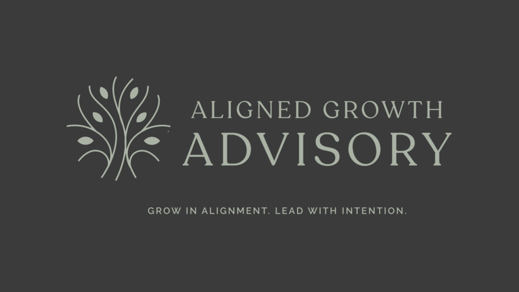
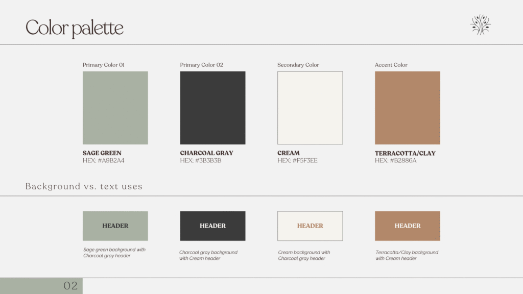
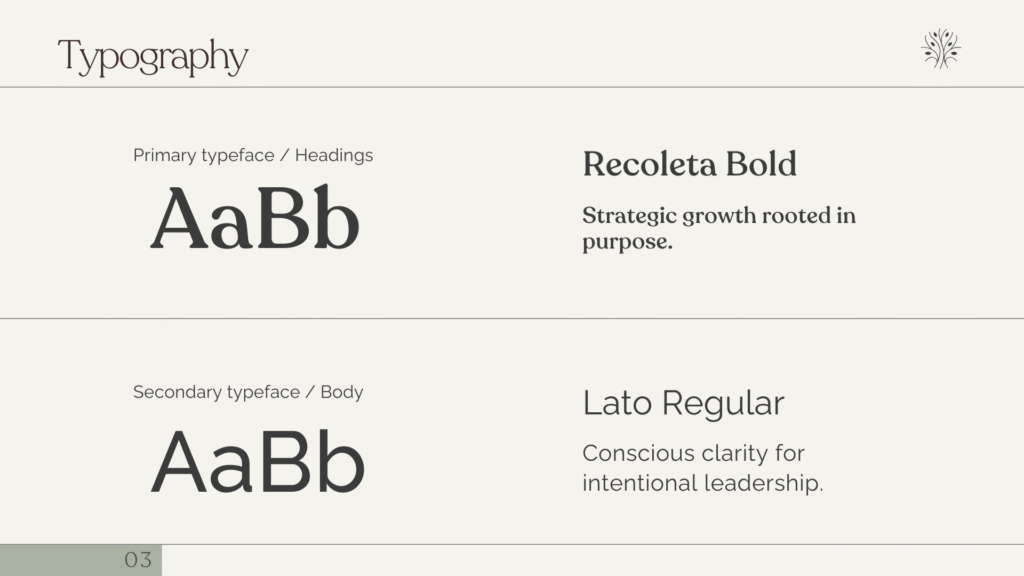
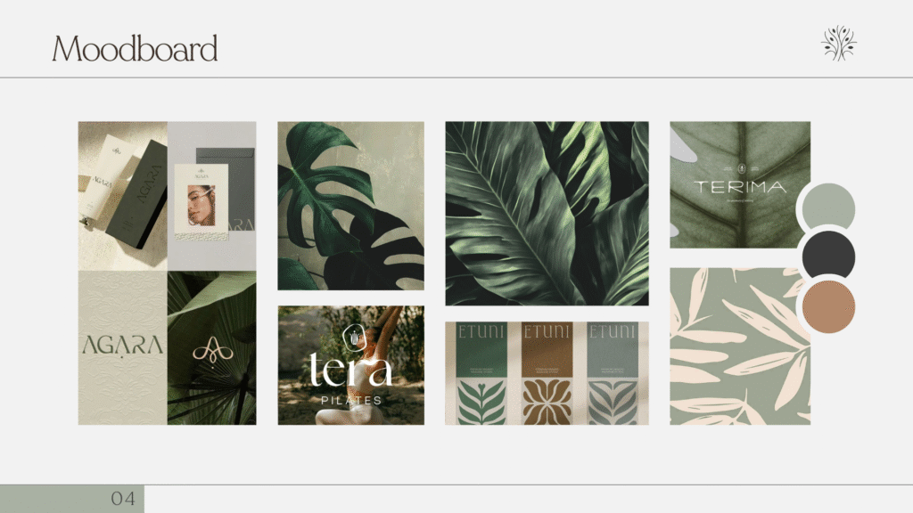
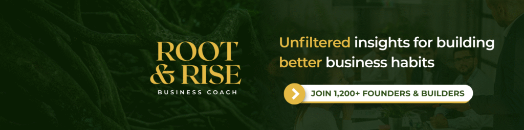
Aligned Growth Advisory’s identity was created to feel calm, strong, and rooted in purpose. The tree-inspired logo reflects clarity and growth, while the earthy palette of sage, charcoal, and terracotta builds trust and stability. Clean, balanced typography ties it all together, giving Aligned Growth Advisory a professional yet approachable presence.

Social Media

From profile covers to content graphics, we design social media assets that keep your presence consistent and professional across platforms.